Graceful Design
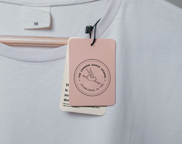
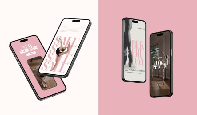
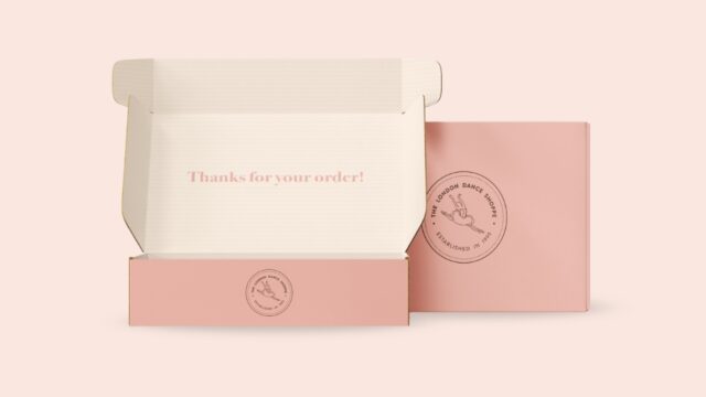
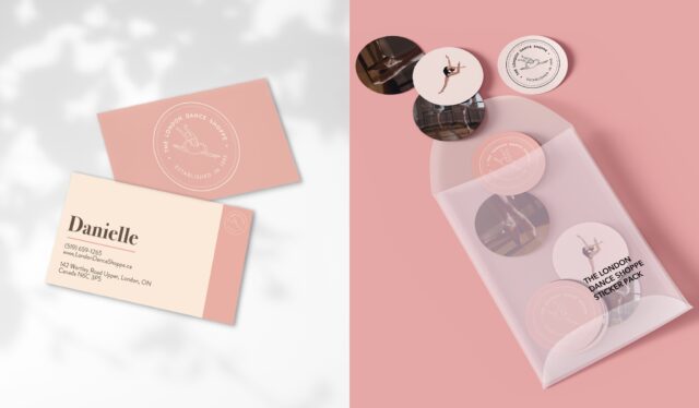
The branding design for London Dance Shoppe beautifully captures the elegance of the dance world, using soft ballet-inspired colors and a minimal font to create a sophisticated and timeless aesthetic. The color palette, featuring delicate pinks, whites, and neutrals, evokes the graceful and refined nature of ballet, while the clean, modern font adds a touch of simplicity and professionalism. This combination ensures that the brand remains both elegant and accessible, appealing to dancers of all ages while reflecting the artistry and dedication that defines the dance community.